[](https://www.npmjs.com/package/@kyvg/vue3-notification)
# Vue.js notifications
This is a fork and port of Vue 2 [vue-notifications](https://github.com/euvl/vue-notification) created by [euvl](https://github.com/euvl) to now support Vue 3. If you're using Vue 2.x use his version.
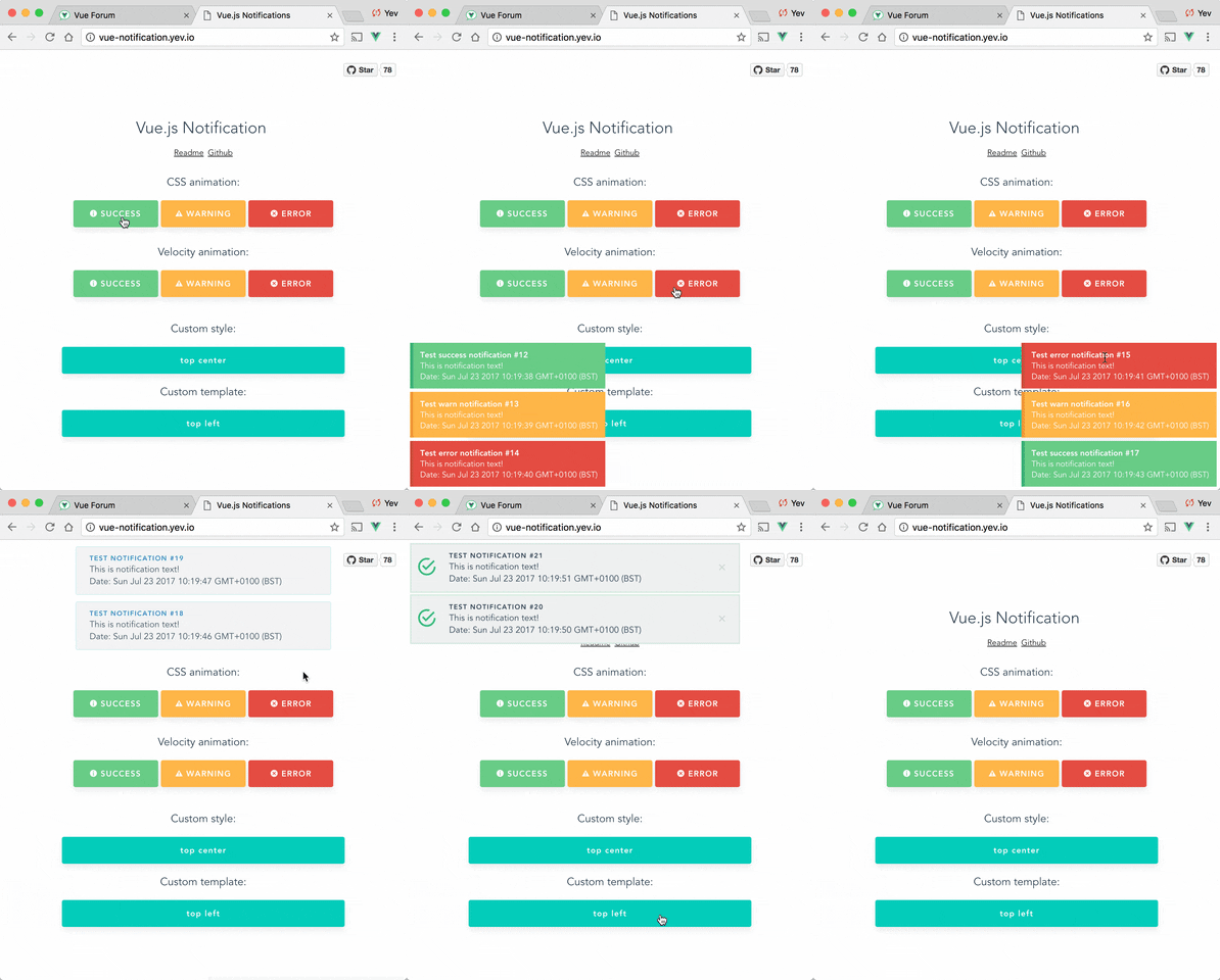
## Setup
```bash
npm install --save @kyvg/vue3-notification
yarn add @kyvg/vue3-notification
```
Add dependencies to your `main.js`:
```javascript
import { createApp } from 'vue'
import Notifications from '@kyvg/vue3-notification'
const app = createApp({...})
app.use(Notifications)
```
Add the global component to your `App.vue`:
```vue
```
## Usage
Trigger notifications from your `.vue` files:
```javascript
// simple
this.$notify("Hello user!");
// using options
this.$notify({
title: "Important message",
text: "Hello user!",
});
```
Or trigger notifications from other files, for example, your router:
```javascript
import { notify } from "@kyvg/vue3-notification";
notify({
title: "Authorization",
text: "You have been logged in!",
});
```
### Migration
#### Vue 2.x syntax
```javascript
Vue.notify({
title: "Vue 2 notification",
});
```
#### Vue 3.x syntax
```javascript
import { notify } from "@kyvg/vue3-notification";
notify({
title: "Vue 3 notification 🎉",
});
```
### Component props
The majority of settings for the Notifications component are configured using props:
```vue
```
Note that all props are optional.
| Name | Type | Default | Description |
| ---------------- | ------------- | ------------------ | ----------------------------------------------------------------------------------------------------------------------- |
| position | String/Array | 'top right' | Part of the screen where notifications will pop out |
| width | Number/String | 300 | Width of notification holder, can be `%`, `px` string or number.
Valid values: '100%', '200px', 200 |
| classes | String/Array | 'vue-notification' | List of classes that will be applied to notification element |
| group | String | null | Name of the notification holder, if specified |
| duration | Number | 3000 | Time (in ms) to keep the notification on screen (if **negative** - notification will stay **forever** or until clicked) |
| speed | Number | 300 | Time (in ms) to show / hide notifications |
| animation-type | String | 'css' | Type of animation, currently supported types are `css` and `velocity` |
| animation-name | String | null | Animation name required for `css` animation |
| animation | Object | Custom | Animation configuration for [Velocity](#Animation]) animation |
| max | Number | Infinity | Maximum number of notifications that can be shown in notification holder |
| reverse | Boolean | false | Show notifications in reverse order |
| ignoreDuplicates | Boolean | false | Ignore repeated instances of the same notification |
| closeOnClick | Boolean | true | Close notification when clicked |
### API
Notifications are triggered via the API:
```javascript
this.$notify({
// (optional)
// Name of the notification holder
group: 'foo',
// (optional)
// Title (will be wrapped in div.notification-title)
title: 'This is the title',
// Content (will be wrapped in div.notification-content)
text: 'This is some content',
// (optional)
// Class that will be assigned to the notification
type: 'warn',
// (optional, override)
// Time (in ms) to keep the notification on screen
duration: 10000,
// (optional, override)
// Time (in ms) to show / hide notifications
speed: 1000
// (optional)
// Data object that can be used in your template
data: {}
})
```
To remove notifications, include the `clean: true` parameter.
```javascript
this.$notify({
group: "foo", // clean only the foo group
clean: true,
});
```
### Plugin Options
Configure the plugin itself using an additional options object:
```js
app.use(Notifications({ name: "alert" }));
```
All options are optional:
| Name | Type | Default | Description |
| ------------- | ------ | ------------- | ----------------------------------------------------------------------------- |
| name | String | notify | Defines the instance name. It's prefixed with the dollar sign. E.g. `$notify` |
| componentName | String | notifications | The component's name |
> **Note**: setting `componentName` can cause issues when using SSR.
## Features
### Position
Position the component on the screen using the `position` prop:
```vue
```
It requires a `string` with **two keywords** for vertical and horizontal postion.
Format: `" "`.
- Horizontal options: `left`, `center`, `right`
- Vertical options: `top`, `bottom`
Default is `"top right"`.
### Width
Width can be set using a `number` or `string` with optional `%` or `px` extensions:
```vue
```
### Type
Set the `type` of a notification (**warn**, **error**, **success**, etc) by adding a `type` property to the call:
```js
this.$notify({ type: "success", text: "The operation completed" });
```
This will add the `type` (i.e. "success") as a CSS class name to the `.vue-notification` element.
See the [Styling](#styling) section for how to hook onto the class and style the popup.
### Groups
For different classes of notifications, i.e...
- authentication errors (top center)
- app notifications (bottom-right)
...specify the `group` attribute:
```vue
```
Trigger a notification for a specific group by specifying it in the API call:
```javascript
this.$notify({ group: "auth", text: "Wrong password, please try again" });
```
## Customisation
### Styling
Vue Notifications comes with default styling, but it's easy to replace with your own.
Specify one or more class hooks via the `classes` prop on the global component:
```vue
```
This will add the supplied class/classes to individual notification elements:
```html
Info
You have been logged in
```
Then include custom css rules to style the notifications:
```scss
// style of the notification itself
.my-notification {
/*...*/
// style for title line
.notification-title {
/*...*/
}
// style for content
.notification-content {
/*...*/
}
// additional styling hook when using`type` parameter, i.e. this.$notify({ type: 'success', message: 'Yay!' })
&.success {
/*...*/
}
&.info {
/*...*/
}
&.error {
/*...*/
}
}
```
Note that the default rules are:
```scss
.vue-notification {
// styling
margin: 0 5px 5px;
padding: 10px;
font-size: 12px;
color: #ffffff;
// default (blue)
background: #44a4fc;
border-left: 5px solid #187fe7;
// types (green, amber, red)
&.success {
background: #68cd86;
border-left-color: #42a85f;
}
&.warn {
background: #ffb648;
border-left-color: #f48a06;
}
&.error {
background: #e54d42;
border-left-color: #b82e24;
}
}
```
### Content
To completely replace notification content, use Vue's slots system:
```vue
```
The `props` object has the following members:
| Name | Type | Description |
| ----- | -------- | ------------------------------------ |
| item | Object | Notification object |
| close | Function | A function to close the notification |
### Animation
Vue Notification can use the [Velocity](https://github.com/julianshapiro/velocity) library to power the animations using JavaScript.
To use, manually install `velocity-animate` & pass the library to the `vue-notification` plugin (the reason for doing that is to reduce the size of this plugin).
In your `main.js`:
```javascript
import { createApp } from 'vue'
import Notifications from '@kyvg/vue3-notification'
import velocity from 'velocity-animate'
const app = createApp({...})
app.use(Notifications, { velocity })
```
In the template, set the `animation-type` prop:
```vue
```
The default configuration is:
```js
{
enter: { opacity: [1, 0] },
leave: { opacity: [0, 1] }
}
```
To assign a custom animation, use the `animation` prop:
```vue
```
Note that `enter` and `leave` can be an `object` or a `function` that returns an `object`:
```javascript
computed: {
animation () {
return {
/**
* Animation function
*
* Runs before animating, so you can take the initial height, width, color, etc
* @param {HTMLElement} element The notification element
*/
enter (element) {
let height = element.clientHeight
return {
// animates from 0px to "height"
height: [height, 0],
// animates from 0 to random opacity (in range between 0.5 and 1)
opacity: [Math.random() * 0.5 + 0.5, 0]
}
},
leave: {
height: 0,
opacity: 0
}
}
}
}
```
## Programatically Closing
```javascript
const id = Date.now() // This can be any unique number
this.$notify({
id,
text: 'This message will be removed immediately'
});
this.$notify.close(id);
```
## FAQ
Check closed issues with `FAQ` label to get answers for most asked questions.
## Development
To contribute to the library:
```bash
# build main library
npm install
npm run build
# run tests
npm run test
# watch unit tests
npm run unit:watch
```